New piece this week :)!
 |
| Elysium, mixed media collage, 20 x 24," 2015 |
 |
| printed on a slightly darker gray this time and added black, white, and gold ink and pink color pencil. |
 |
| with no digital adjustments - I heart safety orange! Each plant has several tones of neon (2 orange, 3 pink, 2 yellow, and light purple and white). Also - I made the little tassels on the gold bow myself :). The robes are in charcoal - I tried to build the folds off the marbling pattern that was already there. |
It was an intense week, making and photographing this one, then filling out the submission paper work. (Barring unforeseen circumstances) it's headed to the
Sylvia Wald + Po Kim art gallery in New York for the 126th Annual Members Exhibition of the
National Association of Women Artists in September.
Participating in N.A.W.A. is important to me, and this may be the only time this year my work will be shown in New York City, so I wanted to make something really, really special.
 |
| no new blocks, but lots of existing ones. |
A little more about the process - it may seem like I made this really fast (5 days), but partly, that's because I didn't carve any new blocks. It's a different way of using the same figurative and wing blocks from
last week, and the plant blocks are from my "archive."
The sleeves and robe are patterned paper. For the sleeves, I masked out the light part then spray painted black (lightly!) over the dark sections to create the illusion of folds and shadows
 |
| busting out the spray paint :) |
For the robe, I purchased the marbled paper, and then tried to see the fold pattern in the existing marbling patterns. I added charcoal and color pencil, and also veins of gold ink where I wanted the light to reflect (inspired by Botticelli and one of my favorite paintings,
The Birth of Venus, ca. 1485)
For the plants, I didn't have to look very far. I was trying to capture the feeling of looking at the plants in my yard. I used a few different colors of neon (I heart neon!). I sprayed each individual element with a coat of UV- protecting glaze, but even so, the color of the flowers will gradually fade (which I think is sad/beautiful).
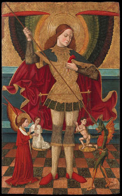
For the iconography of the figure, I've been doing research for a different project on images of St. Michael. Some favorites:

I especially like the gold filigree on black armor in the Spanish versions and the way Bruegel distorted the length of the arm (Mmmmmmm).
On a different note, I also got to see some beautiful Chinese painting locally. I love the use of gold, and the plants and creatures (more visual yum.)


 I especially like the gold filigree on black armor in the Spanish versions and the way Bruegel distorted the length of the arm (Mmmmmmm).


