Monday, May 25, 2015

more phase 6

words, words, words (hmmmm - can we play a game, where we pretend that I said something insightful, then skip ahead to the pictures? ;) ) 
O My! 

so many new blocks this week
almost there on this polyester lithography plate (still a little more to go on the hand on the left, but getting close...)
even so, it was taking so long, that I carved this 1/2 scale version (um, which may have diverted my attention, a little bit ;) ) 

for the feet, I drew directly on the block

and of course, there must be a head.
I carved them all into a single block so that I can ink and print them all at once (a lesson learned from last week's bunny bucks) - it helps keep the ink color and quality even among the parts (thumbs up)
I also carved new wings [Oy.]
...split across two blocks so that they can be articulated.
getting an estimate of how they might look together (with inky fingers for scale...)
 It's been an art-challenging week. Lots of time spent on the floor carving (as thoughts like: "maybe it doesn't really need  2 wings," float by [haha - I kid, but the idea of carving a second wing right now actually sort of does make me want to cry.]

first bouquet from the yard!
I didn't venture far from home, but still lots of beautiful things to see:
and in the local conservation area -
black and blue and a
tiny bit of orange butterfly

and there was this fabulous item
at the local auction house 
A few weeks ago, all I saw everywhere was red,
(this is the actual color!)


...now, everywhere I go, I see blue
and always, lots of industrial stuff

so much gray
  
Nemesis by Albrecht Dürer.jpg
such beautiful gray [pitter - patter, pitter - patter]
Durer's Nemesis, ca. 1501-2

In addition to Durer (heart!), I keep thinking about Goltzius' hand and wing that I saw and photographed in  Philadelphia last year. I can't believe it's almost been and entire year since I saw this: Sine Cerere et Libero friget Venus (Without Ceres and Bacchus, Venus Would Freeze) by Hendrick Goltzius, Dutch (active Haarlem), 1558 - 1617 at the Philadelphia Museum of Art.  I still remember coming across it and getting the "I'm so art-excited, I might vomit" feeling. I never made it to see the museum's famous modern collections and (temporarily) lost the rest of my family, who, fortunately, know me well enough that they assumed "Oh, she just got stuck in the Early European section and is probably not leaving until the guard comes to announce closing (true.)). I loved this picture, but didn't actually see the whole thing (I have a small mental view-finder - I only really saw the wing and the hand, and only know what the whole thing looks like now, because I looked it up online after the fact.) I hope that I can see it again someday, but feel lucky that I got to see it once... just a refresher, for your viewing pleasure :)

Love you Mr. Goltzius!

Monday, May 18, 2015

phase 6 ...

[drumroll...] the third of 3 [and oy.]

Here's a virtual version of what they look like together - I'm happy to be nearing completion on these (*still need to frame, pack and ship them).


I decided to use real buttons and use the sewing of the
buttons as part of the attachment of the layers
(so the buttons are buttons and working as buttons,
 if that makes any sense)
...and a real chain for the watch. The button on the glove is
the same as Columbina's earrings, repeating some
of the elements in different ways across the three pieces.
(I particularly enjoy the drawn in shadow of the
watch on the glove)


I also kept working on the bunny bucks, carving 2 blocks ("A" and "B" - labelled before the date).


with a coin for scale (- the bunny is cuter than George Washington, no?)
then I printed.42 of them...by hand (!) 


I enjoy the mini Hudson whale
I gave them away. 

I also did the prep work and started this ball point drawing on a polyester lithography plate.


Other art goings on...


As we can see, I was one of the first people in the door because  I really  (really, really) wanted to see the work (heart!), but predicted (correctly) that the crowdedness would be panic inducing (true - but I got to spend about an hour looking at the work, and  it's not far, so maybe I can go back  at a less busy time?)

Some of my favorite parts - the way text and patterns make value in the gray (!!), this blackened heart on the inside, and the faces. The artist works with simple tools and found objects (wood, aluminum, and copper wore) - I'm amazed by the way he's able to do so much with what was around him.  I like this work because it's aesthetically pleasing, has lots (and lots) of labor and craftsmanship, and includes creatures/characters/textile-like surfaces. Plus there are  lots of layers, shiny surfaces, text and patterns. (Visual yum - gush!)
Also, the town of Kinderhook is pretty, (though, to me, it sort of felt disturbingly manicured (though it may have been my edge-of-panic mood?)).


 Ryder Cooley & Dustbowl Fairies

Last, but definitely not least! I went to a terrific musical performance by Ryder Cooley & Dustbowl Fairies and Melora Creager - launching the Dustbowl Fairies' indiegogo campaign.  I thought they sounded incredible. I'm keeping my fingers crossed that the campaign will meet and more than meet, and looking forward to hearing the completed album!


and in non-art (but still sort of art) news...
:o !

I baked for one of the first times since
before Christmas, and the doily is from 
the same set as Columbina's collar - lol.

(You can take the artist out of the studio...)

Monday, May 11, 2015

phase 6 update

If you're a regular blog reader (Thank you!), and you may be wondering:"Wait, didn't we already see these?" Yes and no - I'd printed the blocks and arranged these (The first 90%), but this week, I glued them down, sewed them to the paper, and added shadows and reflected color (the last 10% is tough :) ).


I added real buttons; I especially 
like this one because it repeats 
the shape of the central figure's collar. 


There are stitches in the upper and lower folds 
of the eyelid. Even though it's all equally paper,
 it feels a little weird stitching so close to the eyes.


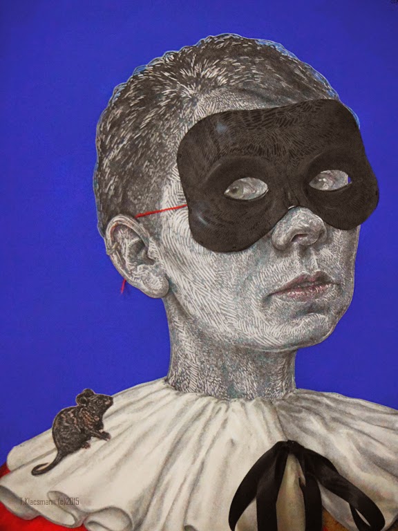
I worked on the details of the features to try to improve the likeness - they're both based on me, but I'm not sure whether they read as different views of the same person or not(?)


a before and after example - on the left, without drawing; on the right, I drew in the shadow that the head would cast and emphasized the folds to make it look more 3D
an example of drawing in the reflected light where color from one thing would spill onto the things around it  - like red on the underside of the white sleeve here.
another a good example - adding green from the bird to the outside of the thumb and far side of the wrist across from it, and adding the lavender to the white as it gets close to the edge of the gloves.
The back - I kind of like it, which cracks me up to admit because I can totally imagine, if I were a student, an exchange that would go something like this:

[professor or indoctrinated classmate]:"Can you flip it over so we can see the back. (Flips, Pause.)...
O, you know, I actually think it's a stronger piece this way - it starts to address absence and negation." 
[Me]: (blink, blink) 
 Lol it's funny now (in a "don't feed the super-ego!" kind of way :P).

proof
But  refocusing...maybe I'm a little worried because refining is challenging, and I'm not sure it makes much difference in photos (even in the close up shots with a caption - Eep.) In the end, I hope it makes the pieces feel different, and maybe that sense of "not quite able to pinpoint why" is part of the magic?

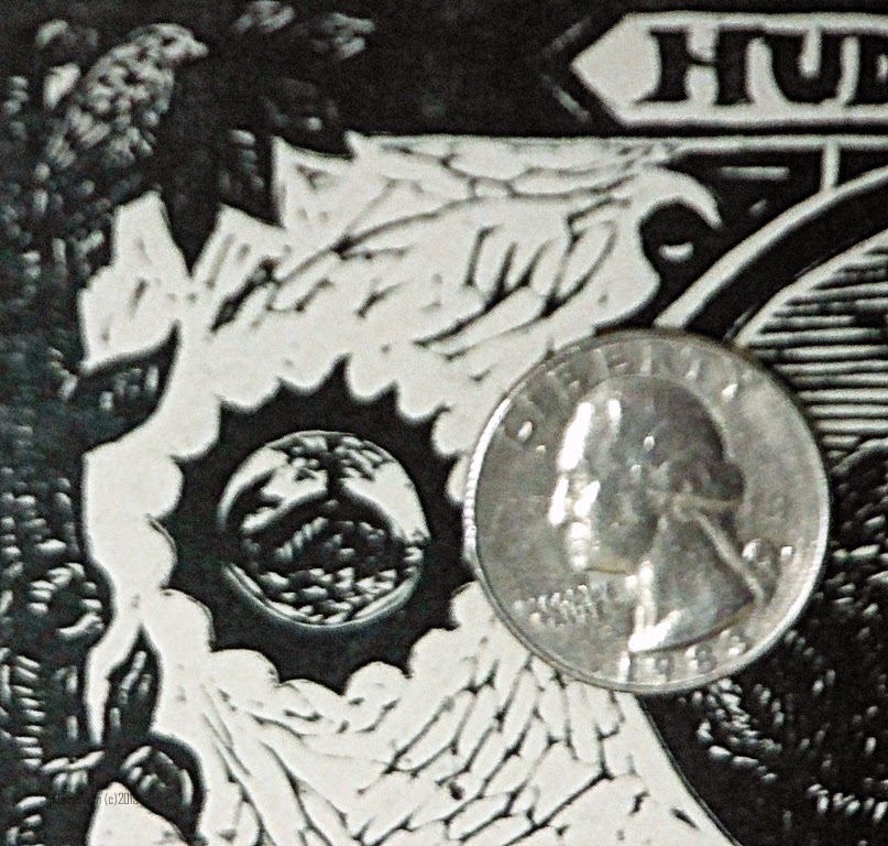
Shaking things up, I started a fun new project - bunny bucks. I've mentioned my love of Durer's Hare (and Alice in Wonderland). I've been wanting to apply what I learned studying engraving last summer with the American Numismatic Association to making money-themed artwork. I like the idea of creating abundance by printing money (the fantasy of something from nothing), but then enjoy humor/absurdity of it's being worthless (the total failure of that fantasy to materialize - the dream revealed as a dream (but still beautiful as a dream?)) - sort of like an art-version of the quest for the philosopher's stone).

I wanted to include writing. Even though I can draw in reverse, I already get a little confused about the letters, so I didn't think I'd be very good at carving the text in reverse. I worked around it by carving a block in the correct orientation.  On the one hand, it's more work, and this block won't lead directly to any prints (because all the text would be backwards)...but it is very good for one (and only one) thing - printing block to block:

block to be carved...
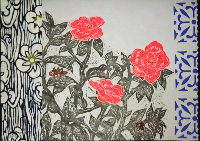
More this week - with layers of patterning
 made by collaging  on the left and by cutting out and looking through. on the right
In para-art new:
nature

more nature
Masks at a local shop
Cute kitty in a basket.
painting the random spot on the floor that I missed the
first time around (?)