Monday, December 26, 2016

and still more fancy garbage

A very busy week in Artlandia...(I know I say that a lot, but it's especially true this week O:) ).

Work continues on the seven deadly sins as represented by (faux-)consumerist garbage. This week I started and printed (!) "Avaritia," "Greed." 

 Just like with "Gula," I made the logo, printed it with a polyester plate, this time directly onto the bag, making the object that is in the print. The I photographed it, edited, made a polyester lithography plate, and printed that plate onto a block. Then I carved the block and printed it. 

It was a lot of steps, but in the end, I think it worked well, because the texts is truly integrated, and they feel like representations of real things (because they are representations of real things - sneaky, sneaky ;) .) 

My favorite thing about this print is that, like printing Gula on metallic paper to mimic it's real material, I printed these on a translucent paper.  The prints are see through, just like an actual bag, and that's especially exciting (to me) because I can put stuff in and behind the bag in collages. (Fun! :D ) 

The only down side - I dipped into my limited supply of my favorite-no-longer-produced blocks.  I cried after I printed these (1) because I was probably pretty tired by that point, and (2) they really are so much more awesome than any of the replacements I've tried. There's no way I would have gotten this print, much less been able to move it from start to finish this week on any other material.  I miss them so, so, so much. 


On that note...trying to learn to love some of the substitute materials...I also finished carving and printed the tracery block from last week.


I also moved into the next phase of work on the aedicule block.  When I printed it last week, I also printed one that was a mosaic of computer sized paper, so that this week I could more easily scan them and then put them back together on the computer.  This gave me a very high resolution image of the 12 x 14" block. 

Now that I have it...I'm ready to start expanding off of it by using it as a unit in a system. (I think pictures may be better than words here to show what I mean):

I tried different things, multiplying it, changing the proportions, changing the central boss by adding another block over it.


This idea to look at it as a unit in a modular system comes from studying Medieval art and how it's made, particularly manuscripts and tapestries, for example:

 Book of Hours for the use of Rome230 x 150 mm, printed by Philippe Pigouchet for Simon Vostre, 22 August 1498, Nativity, designs by the Master of the Apocalypse Rose of the Sainte-Chapelle (Jean d’Ypres?) IB 40341, f. c.v. verso in the British Library
King Arthur (from the Nine Heroes Tapestries), ca. 1400, South Netherlandish, Dimensions:Overall (King Arthur (2a, f)): 168 × 117 in. (426.7 × 297.2 cm) Overall (Hebrew Worthies (2b, c, and h)): 168 × 250 in. (426.7 × 635 cm), Munsey Fund, 1932; Gift of John D. Rockefeller Jr., 1947, Accession Number:32.130.3a; 47.101.4, Metropolitan Museum of Art


Ahhhh, and then there's one of my old favorites, - the Klosterneuberg Alterpiece, by Nicholas of Verdun, ca. 1180 

It's a little funny (? Is funny the right word?) I had the idea for this block back in April/May 2014, and looking back at the blog, I even did the research and took photographs for it...but then didn't make it. In retrospect, that was probably the right decision, because it was a good idea, but I just didn't have the technical skills to do it at the time (I was just learning to carve in relief and hadn't figured out how to maximize the computer and use polyester plates as intermediaries.) For comparisons - this is the tracery block I carved around that time, about 4 x 4" and below is the one now at 12" x 12"

...progress...but still a ways to go before I have a true system of modular parts...baby steps :)


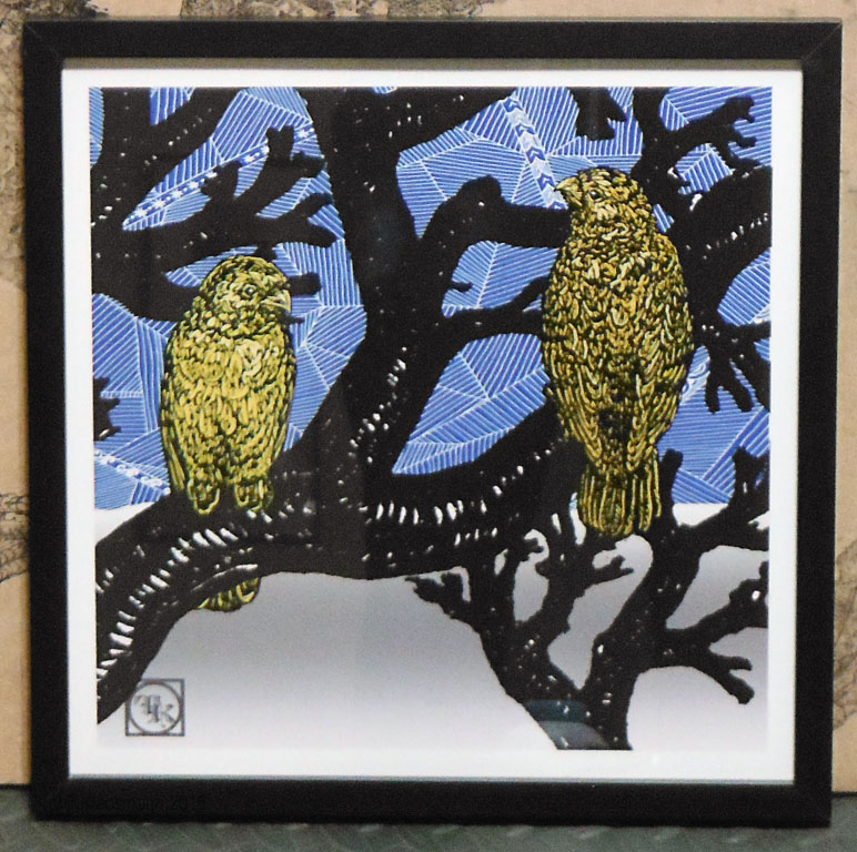
still one of my favorite blocks :)
On the one hand, it takes how long it takes, on the other hand, part of the reason I've been pushing really (really!) hard is because there's a deadline coming up for the Zea Mays flat file (Eep!) I have my heart set on submitting new collages of some of my favorite creatures with the new seven deadly sins garbage with internal tracery frames...

I printed up some of the elements this week, like the raptor head, and started to arrange already printed parts on the magnet board. On the one hand, it's coming together, on the other hand - Eeeeeeep! (fingers crossed!)


When I'm nervous, I bake - big pumpkin bread, little pumpkin bread

Christmas sunrise


Monday, December 19, 2016

More (fancy) Garbage


 First off (drumroll...!) I officially completed the professional certificate in graphics and animation at the University of North Georgia that I started last January! (with a little less than 2 weeks left in the year ;) )  - Whoop!


Having proofed (and proofed) the 18 x 12 tracery block last week, I printed lots of them :)

After last weeks design and prep work, I also made the block for "Gula," "Gluttony, as the next of the seven deadly sins in (faux-) garbage - thumbs up!

x

I also printed these on a silver metallic paper to mimic the sheen of an aluminum can.

Then I transferred a new polyester plate of tracery onto a 9 x 12" block - a very nice transfer (if I do say so myself  O:) )

It was an exciting week - the pup also received her certificate as an AKC Star Puppy!! (I'm so proud of her! - she passed her obedience test and we're continuing to practice so that she may be able to go on and train and become certified as a therapy dog.)

I baked dog (and kitty) treats to celebrate, and they must have been a hit, because I had to rescue the tupperware as she attempted to gnaw it open (notice that front corner, haha).
beauty and brains :)


and because I love all my creatures - both kitties on the press


Monday, December 12, 2016

Tracery!

The 18 x 12" softcut block of tracery is proofed! [two big thumbs up!] 

This was one of the most challenging blocks to print that I can remember (and it still isn't printed "for real," yet, only proofed). Some of it was the conditions - remembering to knead the ink each time to keep it warm; some of it was the block -which I discovered is not quite level ( :o  o my), but a lot of it was how it's carved.

Unlike most of my blocks (like the wings) which are made with sharp edged, non-overlapping cuts, I scraped and gouged at this block a lot to get the variety of tones in the modeling. 

On the one hand, I was trying to take advantage of the softness of this type of block which facilitates that type of mark making...but on the other hand,  I  may (just maybe ;) ) underestimated how much different these would be to print.  A lot of the detail was "filling in" in the early proofs (oy.) It made me really, really miss my favorite, no longer produced blocks. It's hard to remember that those were once new to me too, and hopefully, I'll get better at printing these with practice (fingers crossed!).

The other project in process - now that the Tower of Babel cigarette box for "Superbia" is done, I started on the next (faux-)product for for the seven deadly sins. I drew a logo for "Gula," "Gluttony," scanned it, added text, and turned it into a vector file.  I decided I wanted the can to be crushed, but I didn't really know how to put the logo on a crushed can digitally, so I printed it out, glued it on to an empty can, crushed the can, and photographed it. Then I digitally processed the the photo a bunch of different ways, just trying to understand it better before I start carving.

To get the text going the right way in the final print, I'll make a polyester plate and print it on the block so that the final will be a print of a print (an inverse of an inverse). I feel like I did  do stuff on this...but the block isn't even started (Eep - Onward!)


In para-art news, reflecting on 2016 and looking back through blog posts, I realized my Princess (aka Feline Assistant #1) doesn't appear as frequently as Jr. and the Pup, and I feel I should address this inequality. It might (wrongly) seem like she's not as involved in the studio process, but (with the exception of about a month after Honey joined our family, during which time she was on strike ( "Take that little beast back where you got it from, Human."), the Princess is an excellent helper. The reason she doesn't appear in photos as often is because she's usually sitting on me while I take pictures; so, this week I turned the camera around in tribute to our Senior Assistant:

I've learned to carve with a kitty curled on my back.

...and here we are working on art stuff on the computer.

...and reading about art.
 Lol. She loves to be held, and if the human's hands are not available to carry her, she rides on my shoulder - it's good to be Queen of Artlandia.

Monday, December 5, 2016

An experiment with (fancy) garbage

 Work on the installation continues, and I started putting up landscape elements from the unicorn installation to get a feel for what it might look like with a landscape...but something is not quite right.

Over the printing table is a dry erase board, and each current project or element has a column, and in the column are bullet points of the steps (for example: "Arch" - carve, - print, - refine, -scan, - larger?). Under the heading, "Landscape," there is only one bullet point  "- ???".  It's been that way for over a month.

I know I want the figure to be surrounded by a garden landscape that uses my plant blocks, and I've been researching historic examples and taking photos of any elements I may still need (lots of random photos of grass and pebbles, haha). But...it still wasn't adding up - something is missing. [doh.]

I think the reason has more to do with "why" than "how."  Even if I knew exactly how to build this landscape and had all the necessary blocks and supplies, there would still be a question of what it means.

One thing I would change about the unicorn landscape is that I think it's too simply pretty and doesn't reflect reality enough to connect with the viewer's likely experience of their environment. There is one contemporary element, a discarded lottery ticket I scanned, modified, and turned into a polyester lithography print, but I don't think it goes far enough to have much impact on the content of the piece.

To try to explain with a picture, I think there is a continuum for each artwork between it's relevance and excellence of form, and right now,  it's been aiming for where the X is, but, loving ambiguity and "between-ness," I want it to shoot for the star is, at the point where the question: "is this swatch blue or green?" leads to a mixed result.
This is a round about way of saying that with so much focus on how to make this, it was time for a pause to ask what/why? Conclusion: it needs more garbage.  But not just any garbage, fancy garbage.


I decided it's going to have seven pieces of garbage, all based on things I encounter in my walks, and each representing one of the seven deadly sins.  First up "Superbia," from "super," "above/beyond," and bia," "life" - thinking one's own life is beyond the lives of others in importance (sometimes translated "arrogance," but I think a more contemporary take on this might be narcissism.)  Iconographically, I settled on the Tower of Babel (based on a medieval manuscript version MS Hunter 371 (vol. 1): fol. 5r [Book 1]) and carved a small relief print.


Then I scanned it and turned it into the graphic for a fictional cigarette brand and designed a pack. I turned it into a polyester plate and printed it.

 I want it to have a few points of entrance - on the ground floor, the fact that there is (faux-)commercial garbage in the garden, and then beyond that the graphic, the text, and lastly, on the side I added a slogan in friendly-looking text in English: "Because if will never happen to me!"

I admit to enjoying this, a lot O:) .


With (finally!) some progress on the lower part of the scene, work also continues on the material for the upper part. I'm trying to build a system of modular blocks that can be combined to make different architectural forms (so, for example, with the addition of capitals and columns on the sides it could be an aedicule, or three of them could be placed side by side with pendant bosses between to make an upper frieze.) This 12 x 18" block has been, um, "challenging," [wrist to forehead - dramatic sigh], but it's coming along, bit by bit.


 In other news, "Winter Birds," is printed, framed, and up on the wall as part of the winter show at Gallery 46 until January - thumbs up!

As part of my mission to develop a series of square digital collages to accompany the installation, a new piece this week, "Ring around the Rosie" (which is the first to include the scan of the new initials block - thumbs up. Also, I didn't realize until seeing the photos together for this post, but it uses the exact same color palette as the figure, haha.)
"Ring around the Rosie," digital collage, 11.25 x 11.25" 
And last, but certainly not least, I feel like it's been too long since we had a puppy update! It's gotten harder to photograph her while we're out and about (both hands on the leash!), but I managed to get a good shot of her smile while we were in the conservation area (heart!).
My beautiful little bear is growing up!